Wednesday, 3 June 2009

Keep Calm and Carry On


Something that has had somewhat of a revival since it was originally produced in 1939 is the Keep Calm and Carry On poster. It was initially created by the British Ministry of Information during the outbreak of the war. The posters were never officially released at this time, although some originals were leaked and so a few did appear in the public domain.

"The original poster was issued as a means of allaying public fear. The poster was held in reserve for use only in times of extreme crisis. Although thousands were produced, only a handful ever saw the light of day." -Keep Calm Gallery

Even today 'Keep Calm and Carry On' is a phrase which perfectly encapsulates the traditional British 'stiff upper lip!Now that we find ourselves in economic uncertainty, this phrase seems to have become fashionable again, with sales of the original style poster soaring. A lot of the merchandise can be found at the Keep Calm and Carry On website.


Above is a variation that I discovered through Fffound A good one for junior designers at this time I think. I might pin that one to my bedroom wall to keep me going! As with every fad or trend, it has sparked an offshoot of parodies, which can be viewed on this Keep Calm Flickr Pool.

The one below is great. I'm not entirely sure which shop it is for, but I love how the colours pop with the seasons collection and the tongue in cheek statement. Similarly the carrier bag below aims to do the same thing, by making light of spending money in an economic downturn.


Some of my favourites are "Keep Calm and Put the Kettle On", "Keep Calm and Carrion", and "If in Doubt, Dangerously Overreact". Could look through these for a while!

For more on this subject, check out the Keep Calm Gallery

Sunday, 10 May 2009

Embrace


Just thought this was cute.

Tuesday, 3 March 2009

Screw You


Loving this response to the previously posted item. Although I agree with the pledge message of the first image, this one certainly adds another healthy dollop of wit and really outlines that fact that graphic design is all about breaking the rules. Think David Carson's Ray Gun Magazine Although, you have to learn the rules first before you can break them.

Great book for that purpose is Ten Commandments of Typography
by Paul Felton. Ch-ch-check it out.

Hobo Type


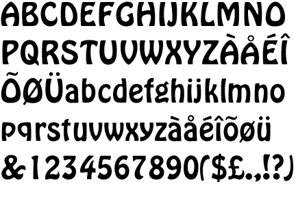
A great designer and friend of mine, Jeff Matz of Lure Design Inc. created this witty typographic poster which outlines what everyone should know about Comic Sans and Papyrus. Don't use them! They are awful, or as Jeff says, "hobo". They are often prolific in use among wannabe designers and desktop publishers who have never studied so much as one page of a typography book and who think 'sans serif' is that girl in the new Frank Miller film.

Lesson learned.

If you would like to buy this poster, go here

Visit Lure Design Inc. for more great posters and designs.

Lure Design Inc.

* I need to make an ammendment here...apparently Hobo is also a god awful typeface which I was until now not aware of. I have just looked it up and am quite thankful for this fact! Urgh!

Monday, 2 March 2009

Fabriclive Posters


I love these illustrations by Garry Milne for Fabric live (art direction by Village Green). The final posters were used for promotions between August & November 2008 for the Fabric live club nights in London.


Milne's collage style employs illustrations of fragments of the natural world which combine to create a larger more sinister image of an animal. His muted palettes are splashed with vibrant and deep colours which are striking and dramatic.

For more of Milnes illustrations visit his personal website here

Wednesday, 25 February 2009

Penguin Classic Hardbacks

Penguin have come up trumps again, releasing their new range of hardback books. The design is simple pattern repetition in two colour. I saw the books whilst perusing through the shelves of Waterstones the other day and I was tempted to buy the whole lot, even though I already own half of the titles.

Below is a close up of Charlotte Bronte's Jane Eyre in red and gray with what looks to be horse chestnut leaves in a traditional arrangement. I will definitely endeavour to introduce them to my bookshelf as soon as I have some spare cash.


I really like this one, mainly for the subtle colours and delicate pattern which I feel really goes with the story of Wuthering Heights. Each pattern is appropriate to the story and I think this is very important, even if it is conceptual and not immediately apparent.


The design is by Coralie Bickford-Smith and more of the covers can be seen on Flickr Other book covers by Bickford-Smith can be seen on her personal website cb-smith.com


More information is available on the Penguin Blog

Tuesday, 24 February 2009

Mossenger


Mossenger is an event created by Anna Garforth as part of YCN Live. The Mossenger project uses moss to create type for the verse of a poem written by poet Elly Stevens. This live art event already took place between August 26th and September 5th, 2008 in Stoke Newington, London. The pictures above show some of the living moss words from the poem attached to the walls.

Also known as 'Sporeborne', it was featured in Creative Review, Oct 2008. Garforth writes:

"It seems as if writing with moss, represents an unusual synthesis between advanced civilisation and nature. It is a chance for us to speak as individuals and artists, but also to be the spokesperson of organisms which have no voice in our world. We hope that not only the words will be noticed, but also the moss itself, put to the forefront through it's sculpting, fashioned into a form we can understand."


Garforth also created the visuals for a flyer and web banner for a conference that CABE (The Commission for Architecture and the Built Environment) are holding on the emerging role of green infrastructure within the urban environment. These images seem to be based on the images from the Mossenger project.

More of Garforth's work can be seen on crosshatchling.co.uk

Monday, 9 February 2009

Design Classics & Bond Stamps


I recently purchased four sets of these new special edition stamps from Royal Mail, depicting some of the greatest design classics of our time. There are ten stamps in each set.

1. Supermarine Spitfire: RJ Mitchell
2. Mini Skirt: Mary Quant
3. Mini Cooper: Sir Alec Issigonis
4. Anglepoise Lamp: George Cawardine
5. Concorde: Aerospatiale-BAC
6. K2 Telephone Kiosk: Sir Giles Gilbert Scott (pictured above)
7. Polypropylene Chair: Robin Day
8. Penguin Books: Edward Young
9. London Underground Map: Harry Beck (or Henry Beck as I know him) (pictured above)
10. Routemaster Bus: Design team led by AAM Durrant

Each of these stamps are clean and iconic, making the stamps themselves sought after design pieces.

I also gave into some special edition James Bond stamps recently, which I won't be using. These are to be saved, since they are too good to use. Each stamp shows a strip of four Ian Flemming book covers, creating an elongated stamp which is more unusual than the standard.


All stamps are available from the Royal Mail

Friday, 30 January 2009

Abandoned


Today I am bringing you images of some interesting looking abandoned buildings. The way these have been shot are quite beautiful in some instances and make you wonder why they haven't been snapped up by some savvy investor to be reinvented and reused as some luxury accommodation.

Well here is your answer. The pictures above are from San Zhi, Taiwan. It is abandoned city in the North of the country and was initially intended for luxury accommodation. However during the construction of these pod like apartments, there were several fatalities.

The government funded project was then halted due to lack of funds and the entire project was brushed under the carpet due to the unusual amount of deaths during site construction. The government wanted to be seen as far away from it as possible to avoid bad press.

An aerial view of the site can be seen here


The above photograph (car) was taken in Centralia, Pennsylvania where an underground coal fire has been burning for years, deeming it an unsafe area to live in. Quite an amazing story:

"Johnathan Faust opened Bull’s Head Tavern in Centralia in 1841, and Centralia was incorporated as a borough in 1866. The anthracite coal industry was the principal employer in the community until the 1960s, when most of the companies went out of business. An exposed vein of coal ignited in 1962 thanks to weekly garbage burning, and as a result a huge underground coal fire commenced. Attempts to extinguish the fire were unsuccessful, and it continued to burn throughout the 1960s and 1970s. Adverse health effects were reported by several people due to the carbon monoxide produced.

In 1979, locals became aware of the scale of the problem when a gas station reported a fuel temperature of 172 degrees Fahrenheit (77.8°C). This provoked widespread attention, boosted in 1981 when a 12-year-old almost plunged to his death as a 4 foot wide, 150 foot deep sinkhole suddenly opened beneath his feet. In 1984, $42 million was spent on relocation, with most residents moving to the nearby Mount Carmel and Ashland. In 1992, Pennsylvania condemned all houses within the borough, meaning that of the 1,000+ residents in 1981 - only a handful now remain - mainly priests. The fire still rages on, and according to experts could do so for another 250 years."

Source: listverse.com

Photograph above with stained glass was taken in Pripyat, Ukraine which had been home to most of the Chernobyl Nuclear Power Plant workers. the place was abandoned due to threat of radiation after the 1986 Chernobyl disaster. The city will not be safe for human habitation for several years to come, and even then it will be a long time before people consider it healthy to develop once again.

Top 10 Abandoned Places

Thursday, 29 January 2009

The Man Who Couldn't Open Doors


Paul Arden unfortunately passed away last year. But he was and still remains, a great asset to the design world. His book
It's Not How Good You Are, It's How Good You Want To Be is my personal bible. Full of inspiration and feel good factors, it helps you through creative uncertainty and gives you the positivity you need to go the extra mile.


Interestingly enough, I discovered that Arden made a film called The Man Who Couldn't Open Doors. This I feel is in the same vein as his bestselling book and something that is very relevant to my experiences at the moment. I am looking for a job after the company I worked for went into liquidation just before Christmas. This is exactly what I am trying to do: open doors.

In this industry it is not easy, many of these metaphorical 'doors' being firmly closed to new graduates and inexperienced newcomers. And in the current economical job drought that we find ourselves in, in Britain, it is much more difficult to cut the mustard...which I just googled and ironically is a graphic design agency! Showing how flooded the market already is.

The short film that Arden produced is beautifully shot, with a great soundtrack and a strong art house suspense to it. A good measure of humour is also thrown in which I find always helps with the witty narration. Enjoy it for yourself below.


Cinematographer: Alex Thompson
Director: Paul Arden
Written by Bo Fowler.